pratt design stars [continued]
dalex design's danny alexander is already a design star in his own right, having won numerous design awards and exhibited at brooklyn's the future perfect and salon del mobile last year. i've mentioned danny before, but i wanted to make sure i added him- he was as sweet as he is talented. click here for more info on danny.
* * * * * * * * * * * *
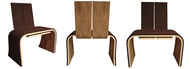
swiss-german design student chrissy angliker was one of the clear standouts- her work is creative, thoughtful and all about breaking design down to its most basic components. her badass fishing rod (a contraption that looks like brass knuckles) simplifies fishing down to its basic elements: lures, string and something to hold the string with. chrissy's arrow chair was another great example of being inspired by a simple form (the arrow) and expanding it to create a 3d design. her work is really impressive and you can find more info on her right here (she's having a solo show this friday. email here for more details). [i'll have more photos from her asap, we had a tech glitch]* * * * * * * * * * * *
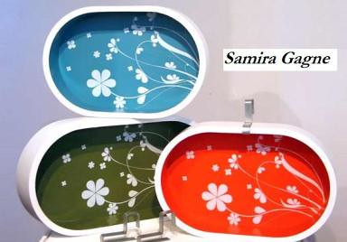
samira gagne was another standout in the group. i wrote about her floral trays after she showed at last year's icff and was happy to see some of her other work- some lovely modern jewelry and a few great conceptual pieces like a clever book jacket that reminds subway goers that you're not interested in chit chat or donating change. i think samira's got a lot of potential for commercial success and i'm really excited to see what happens with her work. she won a major competition with umbra and it think it bodes well for a long and healthy career as a designer. click here for more info on samira.
* * * * * * * * * * * *
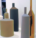
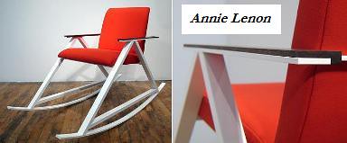
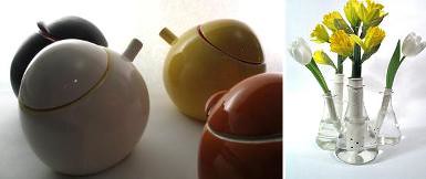
designer annie lenon was another design student well on her way to success. having worked with hivemind design for several years, the influence of their clean modern aesthetic was evident in her work in the best way possible. annie's work was thought provoking, well executed and showed a keen attention to detail that's often missing from student work (i love her rocking chair and test tube vases). i chatted with annie about her ideas for post-grad work and i hope she continues to pursue her own designs in addition to any work for other companies because she's got a great eye and a clear point of view that definitely has a place in the design world. for more info contact annie right here.
* * * * * * * * * * * *
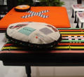
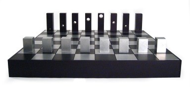
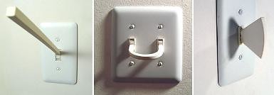
i was nuts about sergio silva. he came highly suggested by all his classmates as the "conceptual" design star. sergio's work looks like it came straight out of the future perfect, and i mean that in a good way. his playful lightbulb lamps and alternative light switches were a fun design experiment, but his chess set designed for a noguchi competition really caught my eye. with a different cut out hole corresponding to each pieces's position in the game, sergio's chess set was elegant, modern and clever. i'd buy it in a heartbeat. for more info on sergio's work you can email him right here. you're sure to see him in the design magazines any day now.
* * * * * * * * * * * *
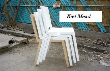
designer kiel mead (pronounced kyle, not keel) is already a design celeb in his own right and is stocked at some of the hottest spots in brooklyn. his rings have been a smash hit and he's already in talks with a major design institution to stock his forget me knot rings. but kiel's real love is furniture design- having studied with the gang at scrapile and bettencourt wood, kiel has a keen eye for good, solid furniture and his line of stacking chairs is a great start. we're sure to see kiel all over the place if he isn't already. click here for more info on kiel.
* * * * * * * * * * * *
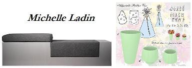
last but not least was designer michelle ladin, who was a total sweetheart and showed me around the show. she's developing some great ideas of her own as well- one of which being a super practical vase made of rubber that can fold down to hold either tall or short stemmed arrangements. a very practical idea when you're faced with storing vases of many different sizes. michelle also designed a great bench as part of a gallery project that has a top that folds over to provide either extra seating or a space to write on. she's certainly got a business savvy head on her shoulders so michelle will undoubtedly go far in the industry. click here to contact michelle. [thanks for showing me around, michelle!]
overall the show was a huge success and i'm looking forward to seeing final projects in person next week. i'll be sure to update with more photos and detailed shots next thursday. so, enjoy and give these guys a hand for their great work and bright, bright futures. [just a reminder, material on this site, including these works, is protected by a creative commons license so keep in mind that student work is not for copying and these guys are pretty wise to their rights are artists. so, hopefully this goes without saying- student work is not for copying.]






















0 Comments:
Post a Comment
<< Home